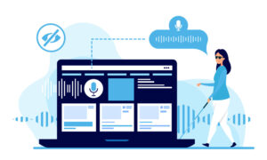
 Online assistive technologies for the blind continue to evolve. Where people with low vision use screen magnification software to aid them in using web sites, the blind use screen readers. One of the most common-and free-screen readers is called JAWS. This software introduces each page to the listener and reads every word on the screen as well as information running behind the scenes. Here are some tips for optimizing your corporate web site for blind users and screen reader technology.
Remove pop-up windows. This technology was built with sighted users in mind. Advertisements or announcements that pop-up in front of a web page can mislead blind users to think they’ve entered the wrong site. Screen readers will speak the web page that is at the front of the screen. Reduce confusion by omitting pop-up windows.
Use alt tags. Now, more than ever, it is important to use alt tags to label images. When a screen reader begins to speak the elements of a Web site it reads the alt tags as well as the content on the page. For spacer graphics and design enabling graphics, consider hiding these from screen readers to reduce the amount of information it has to read.
Reduce links. When a screen reader begins to read a page it starts with how many links are on the chosen web page. The CNN.com web site can list hundreds of links on its homepage. For blind users, more than 20-25 links per page is a nightmare to remember.
Write concisely. Screen reader users can become annoyed and fatigued when they listen to an entire web page of superfluous information. They experience “ear strain” where sighted users have claimed “eye strain.”
Clarify acronyms. Initials are difficult to understand when hearing them read by a screen reader. On the EPA web site, the screen reader says the name of the company is “eppa.” Additionally, the use of ET for Eastern Time is pronounced by screen readers as “eht.” Provide a pronunciation of your company name like “moe mah” for MoMa, the Museum of Modern Art.
Use parentheses and asterisks sparingly. In a 2001 study performed by the Nielsen Norman Group on blind users, they discovered some users flinching or replaying sentences that contained parentheses and asterisks. Very simple text that sighted users never think twice about can be confusing to the blind. For example, “(date)” is read: left parin date right parin. And “***Hot News” is read: star star star hot news.
If you think that people with low vision or the blind aren’t using your web site, think again. Assistive technologies are enabling more people with disabilities to navigate the web, giving them the same access to your web site site as non-disabled users. When designing or redesigning your web site, be sure to ask yourself: “How will my web site sound?”
This article, written by Ben Silverman, originally appeared in PR Fuel (https://www.ereleases.com/prfuel), a free weekly newsletter from eReleases (https://www.ereleases.com), the online leader in affordable press release distribution. To subscribe to PR Fuel, visit: https://www.ereleases.com/prfuel/subscribe/.
